Altus Field Review App
Altus Group tracks monthly costs of construction projects and prepares regular detailed reports for banks outlining a detailed analysis on progress vs spending. As such, they conduct regular field reviews to assess progress. The development this mobile app served as tool to document progress more effectively and connecting to Altus's existing report-building desktop platform.
Project type: Internal reporting tool
Role: UX review & UI
Timelines: 6 months
Microsoft PowerApps mobile platform
Formulating the Problem
Traditionally, the site visit process at Altus involved documenting photos and creating reports after the fact. This process was inefficient and inaccurate. According to one senior member of the team, they had previously tested other mobile apps in the past, and had always encountered the same issue.
"Other apps are too tedious and incompatible with the way we monitor progress"
User pain points
Delayed manual photo uploading
Staff dislikes storing photos on personal devices.
Inaccurate and out of date reporting
Senior staff lack access to real-time site updates.
Value propositions
Cloud photo management
Instant progress visibility for senior staff
Real-time reporting for clients
Reduced billable hours spent organizing media and compiling reports.
After a few casual conversations with senior staff, we formulated the problem as an operational inefficiency, costing the team errors and billable hours
Business process without the app

To improve efficiency, we proposed an mobile app to simplify photo documentation and enable real-time input of progress data.
Business process with the app

Business & User Needs
To further understand business and user needs, we held brief interviews with senior staff, managers, and Juniors who conducted site visits more regularly. Some primary concerns were time efficiency and safety. Findings were organized using affinity mapping.
"We want to avoid staff getting distracted on site"
User needs
Minimize time spent inputing data.
Facilitate categorizing photos.
Avoid tediousness and user fatigue.
Ability to manage multiple projects with ease.
Business needs
Reducing hazardous distractions.
Reduce billable hours spent on administrative tasks.
Ensure integration with Altus desktop platform.
Minimize training staff on the app.
Affinity mapping of meeting notes

User flow of progress updating

Information architecture

Initial Mock-ups
Information gathered during initial workshops served to create the first low fidelity mockup. The aim of this prototype was to act as a starting point to gain more comprehensive insights from staff.
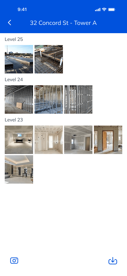
The app incorporated a way for users to take photos and categorize them. It also incorporated a feature to complete the progress report on-site, rather than on excel, leading to real time reporting.

Checklist
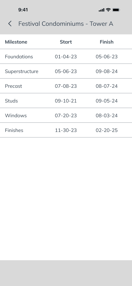
Milestones

Dashboard
Workshop with senior staff
After presenting the concept to senior staff, some initial concerns came up. The progress checklist had roughly 100-150 line items, so it would take users too long to find and update each line item. Filling the checklist created dangerous distractions due to time spent scrolling.
As such, the next challenge was to further optimize data input on the app and reduce scrolling time.
Early Prototypes
Based on the feedback gathered, an improved prototype incorporated a simpler way to update the checklist by organizing items into categories and adding a search bar. Some checklist items, where deemed redundant on user interview and thus removed.
In this version, completing the progress checklist took roughly 15 minutes, while updating the progess matrix in excel took 30-40 minutes. Thus, the app was saving users time.


User testing
Two users tested several mockup versions of the app on site, as well as during virtual meetings. They were asked to note how long it took them to fill the checklist and how intuitively they could find each line item. The prototype got further refinements based on the users's feedback.
According to the users, the app didn't add too much time to their site visit. However, it created the illusion of doing so. As such, the number of line items was reduced where possible. Grouping items by category also eliminated the need for scrolling.
Second workshop with senior staff
Senior staff was happy with the refined version of the prototype. As it allowed for user to print progress reports directly from the app. However, they were concerned its compatibility with the reporting app they were developing for desktop.
As such, I scheduled a meeting with the lead developer to introduce the concept and discuss the feasibility of building the mobile app.
Minimum Viable Product
Meeting with lead developer
The next step was to develop the most refined prototype into a functional mobile app. During the first meeting with the lead developer, he mentioned that he had already worked on a similar mobile app in the past, and had conducted user tests with the Calgary team, who had mixed opinions about the checklist feature. As such he had decided the remove it altogether.
Due to positive feedback from the Toronto team, I decided to include the checklist as an optional feature. Depending on the size of projects and scope of work, some users would benefit from using the checklist feature while other's saw it as extra work.



Note: As per Altus's policies, sharing any internal data concerning clients is prohibited. As such, a link to the MVP is not available. This prototype encompasses changes included in the final product.
What changed?
The final version incorporated a more simplified user flow that prioritized first time users. This was accomplished by reducing the number of user decisions needed, keeping it to a maximum of two, where possible.
Optimized user flow

Product launch
The final version of the app was developed on Microsoft PowerApps by the Altus Toronto team. It served primarily as a platform to take and store photographs within Altus's Sharepoint.
Lessons & Outcomes
The Site Visit App is currently being piloted with Canadian employees at Altus Group, with plans to scale to international offices in the future. With over 300 potential users, the project continues to evolve and integrate with other internal tools, including the Report Writing App. A few major take aways include the following:
Communicating the value of UX. Creating an interactive prototype early in the process was essential to help stakeholders understand the app’s potential impact and secure buy-in.
Justifying design decisions - Advocating for specific features, such as the checklist feature, required clear, evidence-based rationale to distinguish the app’s benefits from existing tools.
Evolving user perspectives. Initial user feedback reflected some confusion, but user sentiment improved significantly as they became more familiar with the app. This highlights the importance of iterative testing, and accounting for user's learning curve.